Chapter 4 (An Infinite Number of) Shades of Gray (or Brown)
We’ve taken the two-kinds-of-people idea pretty far already. But it’s time to acknowledge the elephant in the room. Not every question about attributes, preferences, or behaviors can be answered in such an either/or manner. Digitidiness might be one of those things. Consider the following dialogue:
Stacy: “There are liberal and conservative kinds of people, Trang. Which one are you?” Trang: “Well, you know I’m not sure I’m exactly one or the other. I think I’m somewhere in the middle.”
Although we often use them as discrete categories, the words liberal and conservative might be better thought of as endpoints of continuous scale. In fact, they might even apply to different dimensions of political thought with respect to social issues or economic issues. If you think about it, it’s not hard to come up with other examples of “categories” that really just describe one end or another of a continuous scale. Yes, there are short people and tall people, but everyone has a height, and a lot of people are “about average.” Height is just a number on some scale. So it wouldn’t necessarily make sense to put people into the categories of tall or short.
This may be an old-timey analogy in the age of digital streaming, but think of the knobs on a stereo receiver. Some of them click between categories, like the input-selector (phono, radio, aux). And some of them turn smoothly through continous values, like volume and tone. Categorical, or discrete, variables are the clicky knobs.
In the great toilet paper debate, we were able to identify two kinds of people based on two possible responses to the question of roll orientation. Two answers; two kinds. If instead of discrete categories, we have a number on a continuous scale, does that mean that there can’t be “kinds” of people anymore? To answer this question, we’ll need to understand what exactly we’re talking about when we characterize people using a continuous scale.
Poopiness
Consider poopiness. And consider a scale where some people are really poopy (close to poopiness = 1), some aren’t poopy at all (close to 0), and many are somewhere near the middle. That’s not a very quantitative description. I used the words “some” and “most”, but I didn’t give you counts like I did in Table 1.1 about toilet roll orientation. I will try to do that in just a minute. Meanwhile, notice that my scale here runs from 0 to 1, which I will also sometimes write as [0,1]. When it comes to height, we have well-established scales, like inches or centimeters, and we can use measuring sticks. But when it comes to liberalism or poopiness, the scale does not necessarily refer to something we can see directly. Nevertheless we can use the scale to compare people and to see how a whole bunch of people “measure up.” I’ve set the scale to [0,1], because it is a common scale, but it could have run from 1 to 10, for example, without significantly changing anything in what I’m about to say.
If I showed you the poopiness data for a sample of people, the list would look something like Table 4.1. As before, in this table each row stands for one person. To protect their identities, everyone is identified only by a number (e.g., 0083), which is shown in the first column. In the second column is each person’s poopiness value.
| poopiness | |
|---|---|
| 0040 | 0.319 |
| 0140 | 0.703 |
| 0033 | 0.401 |
| 0107 | 0.544 |
| 0031 | 0.538 |
| 0100 | 0.657 |
Poopiness is shown as a decimal number. Part of the reason I’ve used this scale, instead of 1-100, is to emphasize that the data values can be arbitrarily close to one another. Two values may be different by 0.1 or 0.03, or even 0.000027, if we have enough precision in our data to say such a thing. These data are called numerical or quantitative as opposed to categorical. There are actually 148 values in the data set, but I’ve only shown the first six in Table 4.1.
It’s not as easy to make sense of a bunch of decimal values like this as it is to look at simple counts of categories (like 17 for chunky, 23 for smooth). However, this sense-making problem has been solved by representing the same data using dot plots, stacked dot plots, frequency tables, and histograms, which you can read all about in any standard textbook (for example OpenIntro Statistics, Chapter 2). I’m going to go straight into the frequency table and histogram, which you may indeed have seen before. These are the most commonly used representation for data of this kind.
Again, it is a bit awkward to count how many people have poopiness value of exactly 0.473. Maybe there is one, maybe none. How would we interpret that answer, anyway? Instead, we can group values into ranges, or “bins”, e.g. 0-0.05, 0.05-0.1, 0.1-0.15, etc. so that the ranges together span the entire possible range, which in this case is [0,1]. We can then count how many of our data fall into each bin.5 This table of counts is typically called a frequency table. Frequency is just another word for counts.
| Range | Frequency |
|---|---|
| 0 - 0.05 | 0 |
| 0.05 - 0.1 | 0 |
| 0.1 - 0.15 | 0 |
| 0.15 - 0.2 | 0 |
| 0.2 - 0.25 | 2 |
| 0.25 - 0.3 | 9 |
| 0.3 - 0.35 | 12 |
| 0.35 - 0.4 | 9 |
| 0.4 - 0.45 | 9 |
| 0.45 - 0.5 | 14 |
| 0.5 - 0.55 | 14 |
| 0.55 - 0.6 | 9 |
| 0.6 - 0.65 | 19 |
| 0.65 - 0.7 | 9 |
| 0.7 - 0.75 | 13 |
| 0.75 - 0.8 | 16 |
| 0.8 - 0.85 | 7 |
| 0.85 - 0.9 | 5 |
| 0.9 - 0.95 | 1 |
| 0.95 - 1 | 0 |
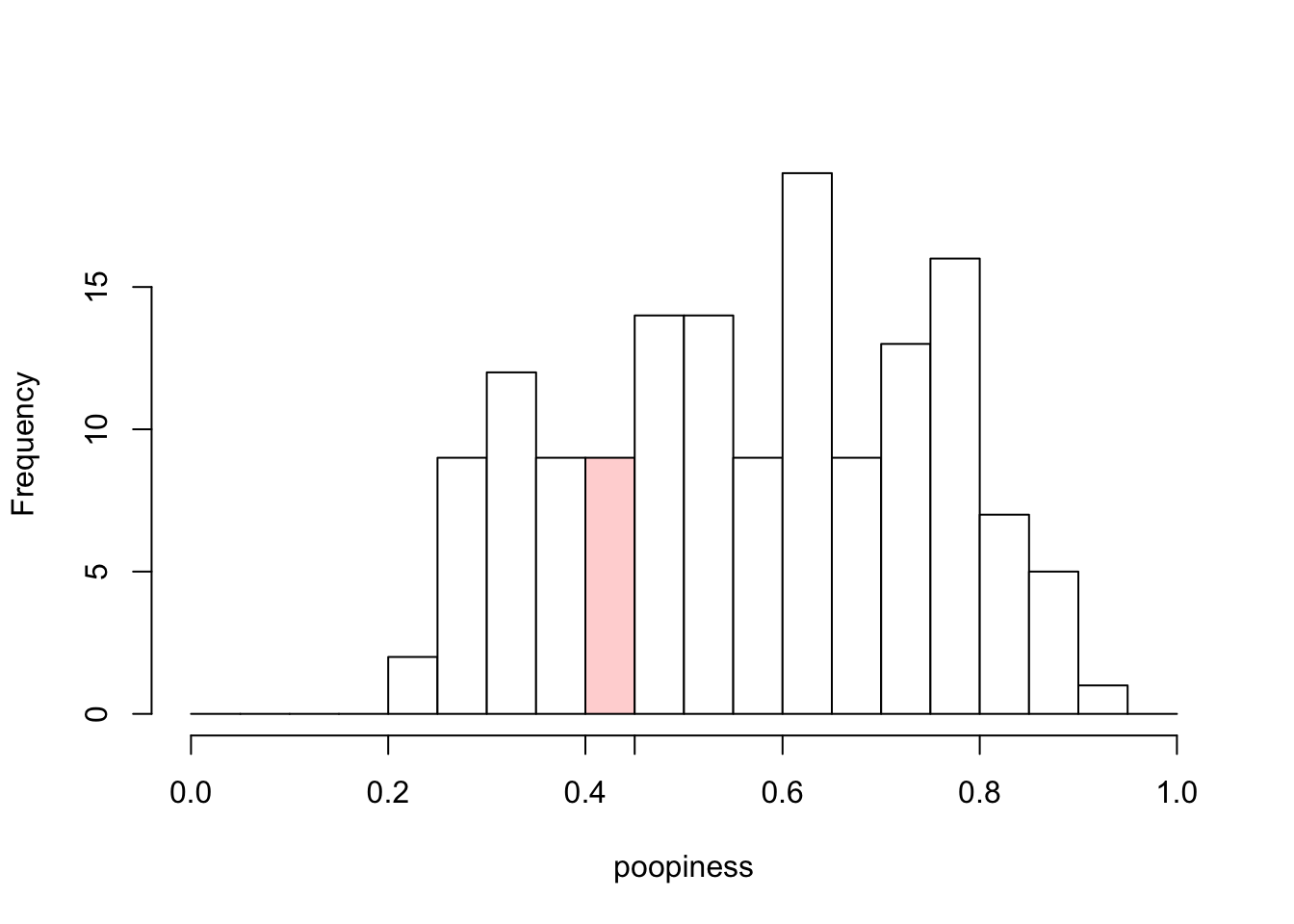
Figure 4.1: Histogram of Poopiness
A histogram is a bar plot of counts for values that fall into certain numerical ranges. So it’s a bar plot of the data in Table 4.2. But oftentimes you’ll just see the histogram without the frequency table. It is worth noting that the information contained in the frequency table is equivalent to the information contained in the histogram, but it is sometimes easier to get a general idea of what is going on in the data by looking at the histogram.
Consider the range of poopiness values from 0.40-0.45. Our data set has 9 values in this range, as you can see in Table 4.2, so the height of the bar above this range of values on the x-axis (horizontal axis) is 9. I’ve colored it in pink only to help you see what I’m referring to. The y-axis in Figure 4.1 is labeled “Frequency”, as in the table. Some more jargon: the numerical values that separate the bins are called “breaks.” In Figure 4.1, the breaks occur are at increments of 0.05.
Question: Given that there are 20 possible bins in the histogram in Figure 4.1, but only some of them have non-zero counts, are there 20 kinds of people (in terms of poopiness) or 15 kinds of people?
Trick question? You bet. The breaks (and thus bins) in a histogram are arbitrary. I can choose any breaks I want, as long as all of the data points fall into exactly one bin. (I can’t just exclude some bins, though. That would be cheating.) The histograms in Figure 4.2 are both perfectly valid histograms. One of them has four bins, and one of them has only two bins.
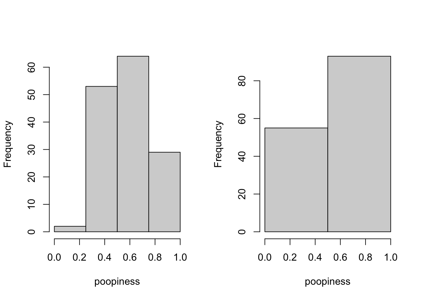
Figure 4.2: Other Histograms of Poopiness
It’s tempting to take the counts on the right of Figure 4.2 and declare that there are two kinds of people. After all, this gets us back to familiar territory. Ta-dah!
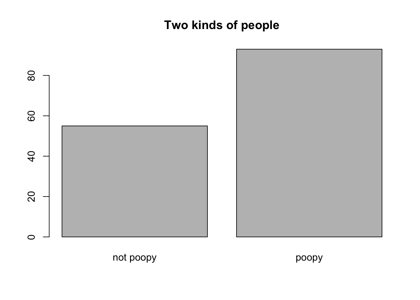
Figure 4.3: This is a terrible, horrible, no-good, very-bad thing to do.
As you can tell, because it says so right in the figure caption, this is terrible, horrible, no-good, very-bad thing to do. Why do you think it is a bad thing to do? Choose one:
- The split was made at 0.5 on the poopiness scale, but that is not the average value of poopiness in the data set, which is closer to 0.57, as can be seen in Figure 4.1 (or from the “raw” data themselves).
- You should always use at least 5 bins when you have numerical data
- Representations of data should communicate honestly about the nature of the data themselves. In this case, poopiness is not a category.
What I did here was take a numerical/quantitative value (poopiness) and mis-represent it as a categorical value. I did it by dichotomizing it, i.e., by splitting off everyone above 0.5 and labeling them as “poopy”. I could have alternately split at the mean or median value and labeled the resulting two groups as “low poopiness” and “high poopiness.” But this would still have been a mis-representation. It would hide the fact that poopiness comes in a continuous range of values.
ASIDE (delivered in a hushed voice): I won’t be able to convince you of this now, but it turns out that if you do this—if you dichotomize numerical data—you will BREAK STATISTICS! Ok, that sounds a bit dramatic. But in all seriousness, one of the jobs of statistics is to understand associations between different variables, such as poopiness and, say, earning potential. If you treat poopiness (or other variables) as discrete when they are really continuous, you may very well get the wrong answers. As the man down the street from where I used to live often muttered to himself while waving his arms in the air, THAT IS AN ABSOLUTE IRONCLAD MATHEMATICAL FACT. No, but in all seriousness, there is a very good paper on exactly this subject (MacCallum et al. 2002).
Dang it! you say. You’ve taken me down this rabbit hole of poopiness for too long. How many kinds of people are there? Are you saying that if one looks at properties that are described by numbers instead of categories, that are no kinds of people at all? Is it all just shades of gray (or brown)?
Mixtures
Remember Figure 4.1? (Don’t click it!) Here it is again so you don’t have to scroll back. Data scientists like to say this picture shows you the distribution of poopiness in our sample. Statisticians use the word distribution in a more formal way that is best put off until we actually need it. We don’t need it yet.
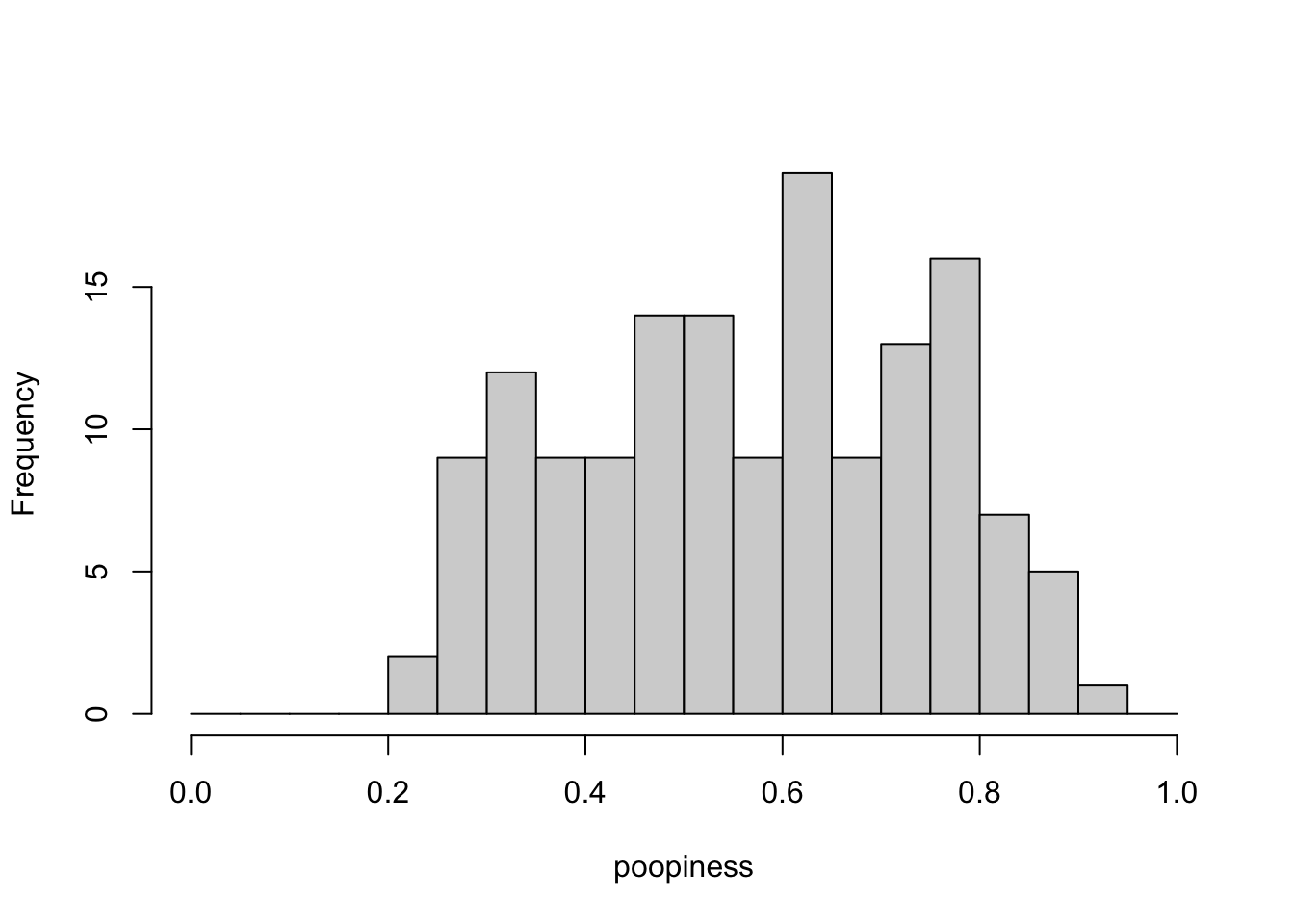
What if I told you that there ARE two kinds of people; you just can’t see them unless I give you special glasses (or more information). If I gave you special glasses (or information), you would see this:
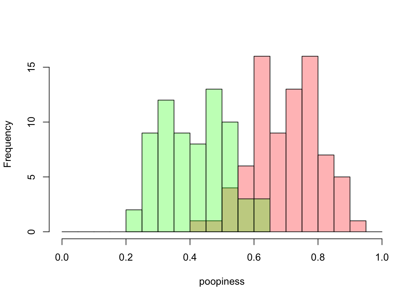
Figure 4.4: A mixture of poopiness
By what dark magic have you colorized the data! you say. Or, perhaps you just said, hm, interesting. In Figure 4.4, I’ve made a histogram with bars in two different colors, light green and pink. The colors are slightly transparent so that you can see both the green and pink distributions in their entirety even though they overlap. That’s what the brownish bars mean. You’re looking at the overlap of the green and pink bars, not another set of bars. Now, if you compare this histogram closely with the original, colorless histogram above, you’ll see that the bin ranges are the same (width=0.05), and the the counts of green and pink bars add up to the total values that we had before. If there are green people and pink people, or in any case two different kinds of people, and if their poopiness is distributed as shown in Figure 4.4, then the poopiness of the mixture of these two groups of people will look just like Figure 4.1.
Ok, but that doesn’t explain how you would know that there are two groups. If I didn’t tell you. That’s because you wouldn’t necessarily know. You would need to have more information. Now you might suspect something if you saw a distribution that looked like this:
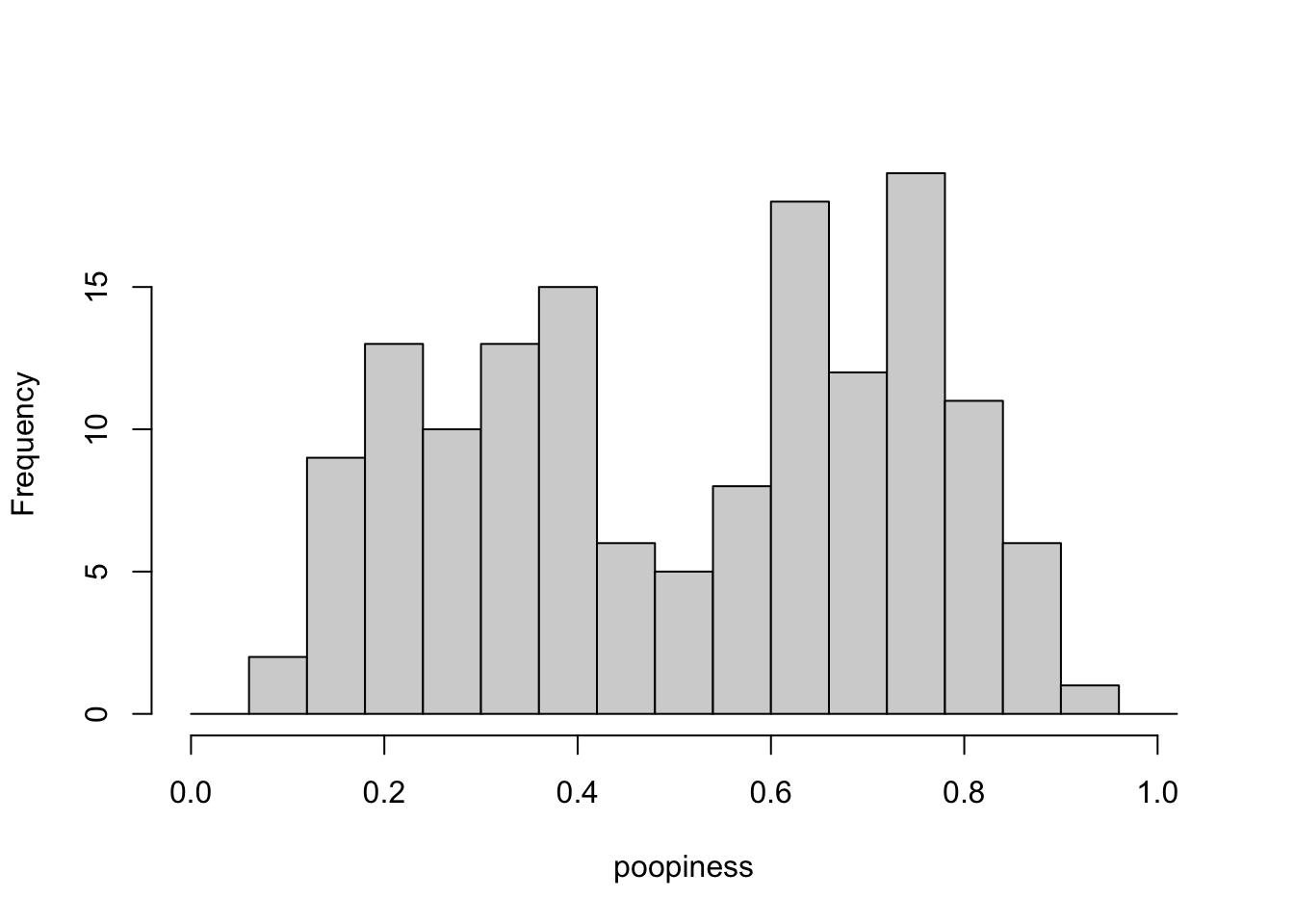
Figure 4.5: A suspicious mixture of poopiness
In Figure 4.5, the distribution has a double-hump like a Bactrian camel. In spite of that, it is not called a Bactrian distribution–which would make me happy–but a bimodal distribution. The point that I’m trying to make here is that a bimodal distribution makes you suspect that there could actually be (at least) two groups mixed together in our data.
But the original data for poopiness did not look bimodal. I suggested to you that you would need more information to determine if there are two groups. And so, I present you with… Crappiness!
Crappiness
For each of the subjects in our poopiness data set, we have also collected data on their crappiness. Crappiness is also reported as a numerical value ranging from [0,1]. It’s sort of like poopiness, but different. Here are some values:
##      poopiness crappiness
## 0040     0.319      0.564
## 0140     0.703      0.415
## 0033     0.401      0.729
## 0107     0.544      0.374
## 0031     0.538      0.853
## 0100     0.657      0.316
And here…(drum roll please)… is a histogram of crappiness!
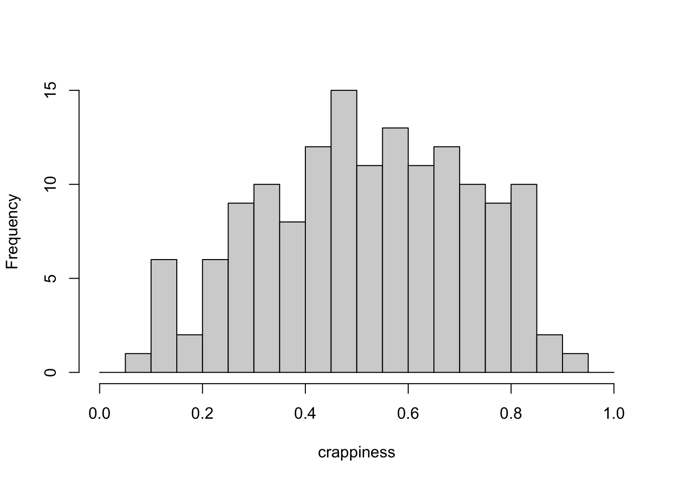
Figure 4.6: Histogram of Crappiness
Hmm. I bet you were hoping that the crappiness data would look obviously bimodal, but it’s not obvious. Nevertheless, hopefully you trust that I wouldn’t lead you on a wild goose chase for no reason. Perhaps you can even see it coming. If we look at poopiness and crappiness separately, there is no clue that there might be distinct groups of people in our data set. But if we look at them together… there is.
When we looked at categorical data for two two-kinds-of-people questions, we made 2x2 contingency tables. We also used the word “dimension”, for example to say that we were describing people along two dimensions (recall: toilet paper and peanut butter). Now that we are looking at numerical data (poopiness and crappiness), we can also use two dimensions, as in a two-dimensional scatterplot, to examine both variables at once.
A scatterplot is just a name for a data plot, in which the position of each data point corresponds to its coordinates along more than one dimension. We often refer to two-dimensional coordinate systems as (x,y), where x is the horizontal axis and y is the vertical axis. Technically, in this case our coordinate system is (poopiness, crappiness). These are the names of our dimensions. But we will still often refer back to the idea of an x- or y-axis. This scatterplot is shown in Figure 4.7. Each point represents data from one person, with their poopiness value on the x-axis and crappiness on the y-axis.
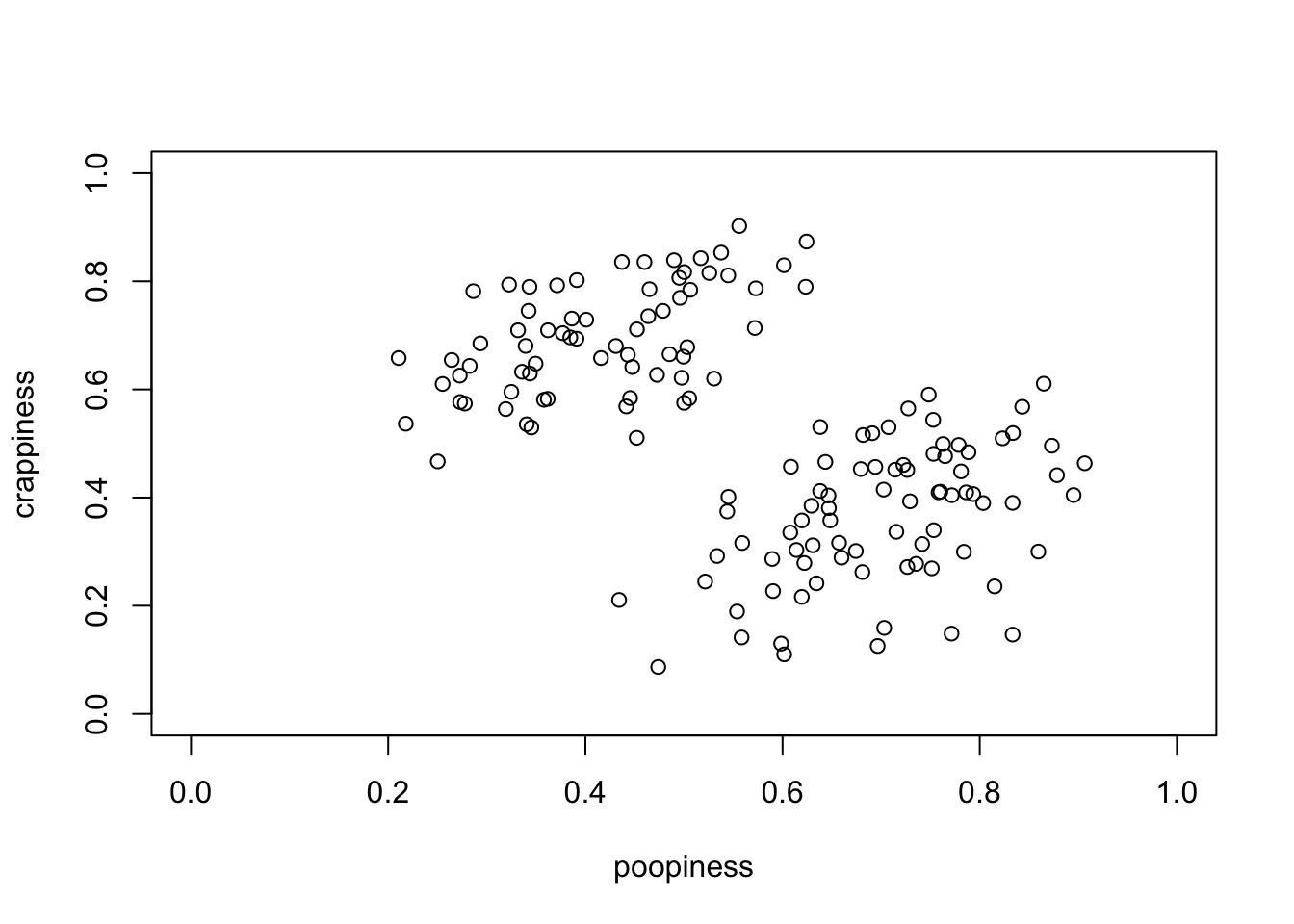
Figure 4.7: Scatterplot of Crappiness vs Poopiness
How many kinds of people are there? When it comes to poopiness and crappiness, people exhibit a continuous range of values, so we can’t neatly put them into buckets. Neither poopiness nor crappiness appear to be bimodally distributed on their own. However, when examined together, as in the scatterplot in Figure 4.7, a pretty suggestive pattern emerges in the data. There are two clusters of points, one group of which is lower in poopiness but higher in crappiness than the other. Interestingly, though, in both groups poopiness and crappiness tend to increase together. That is, they appear to be associated, not independent.
I do not mean to imply that clusters of points can always be found if we have data along many dimensions. That is certainly not always the case. The present example was concocted (I admit it!) to show that groups can emerge, even in numerical data. Cluster analysis (Kaufman and Rousseeuw 2009) refers to set of data-science methods all about looking for the existence of groups in multidimensional data.
References
Technically, each range is a semi-open interval, e.g. (0.1,0.15], so that any values exactly equal to 0.1 can only be included in one bin and not the ones on either side.↩︎